
LIZZOISMS
Typography-focused style frames using Lizzo's lyrics and exploring her various visual and musical aesthetic influences. Each composition represents a different song and would animate in a playful loop on @lizzobeeating’s Instagram.

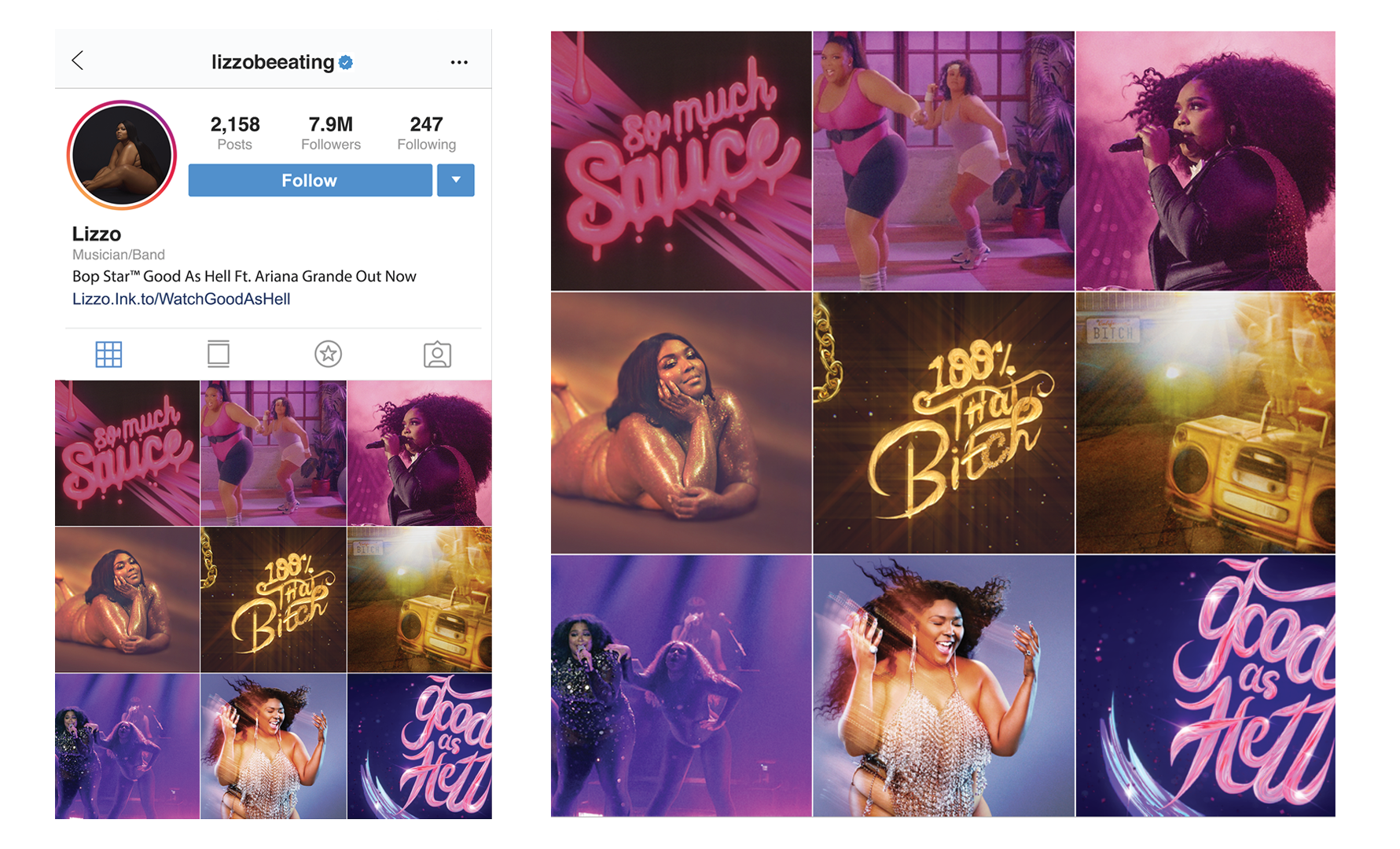

The first set of frames comes from Lizzo’s single Juice — a vintage funk-pop anthem with a glam-rock texture that does not let up.


Here the visuals are all about the bling & the gold for the track, Truth Hurts. In a nod to the lyrics a DNA chain splits becoming two chain necklaces, which then serve as a text reveal.

The final composition, “good as hell” comes from Lizzo’s song of the same name. These visuals are centered around celebration and reclamation using a hyper-feminine aesthetic.


PROCESS


Project Information
DISCIPLINES
Branding
Advertising
Design for Motion
Design for Social
SKILLS
Typography / Hand Lettering
Compositing
3D Design
Creative / Art Direction
TOOLS
Pen & Paper
Adobe Illustrator
Adobe Photoshop
Adobe After Effects
Maxon Cinema 4D
ROLE & SCOPE
Self-directed motion campaign exploring typography as a narrative system.
Defined visual strategy and animation language for a cohesive, system driven series designed for social formats.